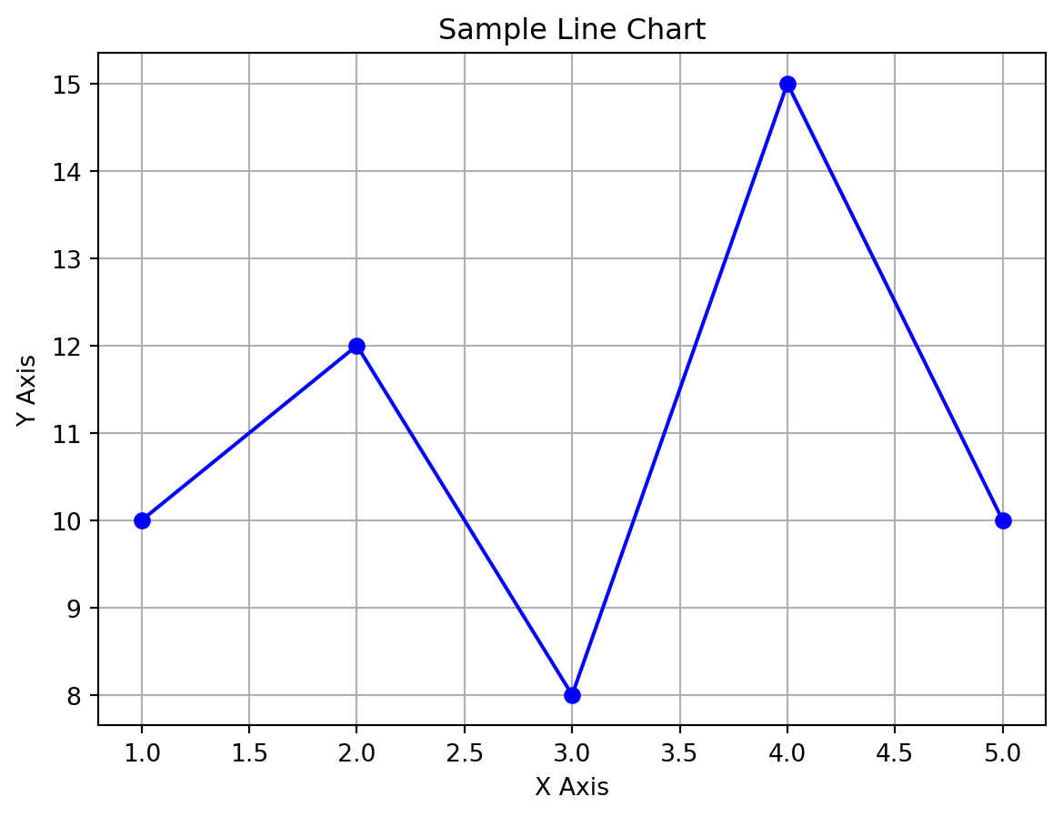
matplotlib demo

Author

Anu Sharma

Published

September 10, 2025

Code
import matplotlib.pyplot as plt

# Sample data
x = [1, 2, 3, 4, 5]
y = [10, 12, 8, 15, 10]

# Create the plot
plt.plot(x, y, marker='o', color='blue', linestyle='-')

# Add title and labels
plt.title('Sample Line Chart')
plt.xlabel('X Axis')
plt.ylabel('Y Axis')

# Show grid
plt.grid(True)

# Display the plot
plt.show()

Code
import matplotlib.pyplot as plt

# Sample data
products = ['Apple', 'Oranges', 'Bread', 'Coco Cola', 'Soap']
units_sold = [50, 200, 120, 80, 150]

# Create the bar chart
plt.bar(products, units_sold, color='skyblue')

# Add title and labels
plt.title('Bar Chart')
plt.xlabel('Product')
plt.ylabel('Units Sold')

# Rotate x-axis labels for readability
plt.xticks(rotation=45)

# Display the plot
plt.tight_layout()  # Adjust layout to prevent clipping
plt.show()